Five things every grid needs on its home page
I have a new OpenSim grid stats report coming out tomorrow, so I’ve been surfing OpenSim grid websites these last couple of days, looking for errant stats pages. And that means that I’ve been looking at a lot of grid home pages. And there are some really pretty ones out
I have a new OpenSim grid stats report coming out tomorrow, so I’ve been surfing OpenSim grid websites these last couple of days, looking for errant stats pages. And that means that I’ve been looking at a lot of grid home pages.
And there are some really pretty ones out there! And some grids truly use their websites to show off what they’ve got to offer.
But most grids, I’m afraid, miss the mark. If you’re a public grid and want to attract traffic, or a commercial grid looking to rent out land, you’re leaving money on the table by not having these five elements on your home page.
A beautiful picture that shows people enjoying your grid
A picture is worth a thousand words, and when it comes to your OpenSim grid’s website, the right picture can make all the difference. As I browsed through dozens of grid home pages this week, I was struck by how few of them featured images of people enjoying themselves. In fact, I could only find four examples, and two were avatars from other platforms, not actual grid residents.
This is a missed opportunity. Your grid’s home page is the perfect place to showcase the fun and excitement that awaits visitors. Even if your grid is brand new, you can still create engaging images. Pose some alts in dance animations, have them chatting in a cafe, building a house, working in a garden, or raising farm animals. The possibilities are endless.
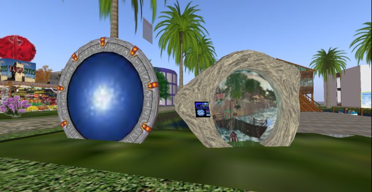
Too often, grid slideshows and images focus on empty spaces — a deserted dance floor, a vacant cafe, a barren island, or a lonely rock. Sure, sometimes it’s a pretty rock, but it’s still just an empty landscape. The same goes for pictures of museums or shopping areas — if they’re devoid of people, they look like ghost towns.
By featuring images of empty spaces, you’re sending a subconscious message to potential visitors: “Our grid is an empty wasteland.” That’s not the impression you want to make. Instead, show people having a great time on your grid. Capture the excitement of a fashion show, the energy of a rock concert, or the camaraderie of a community event.
If you don’t have a skilled photographer on your grid, consider reaching out to the OpenSim community. There are plenty of talented photographers who would be happy to take some great shots of people enjoying your grid.
One of the grids that featured prominent images of people enjoying themselves in their world was the New Life Italy grid.

I’m not saying that every grid should put a picture of a dance floor on their home page. OpenSim grids would all look pretty much identical if everybody did this. Hopefully, your grid has more to offer than just dancing, or, if there is dancing, maybe it’s in a particularly special location? And when taking pictures of people enjoying themselves, try to have at least one closeup of an avatar’s happy face.
Again, I’m using an illustration from New Life Italy‘s home page here:

My theory is that many grid owners and website managers are technologists at heart. They prefer to work by themselves.
You, as a technologist, might enjoy a home page that is full of dense text, statistics, details of your server configurations, and capacity utilization charts. But you target audience doesn’t. If they did, they would be running their own grids — they wouldn’t need to rent land from you!
Sure, a percentage of your customers will also be loners, or people who might like a little quiet time once in a while. But most people are going to come to a social grid to socialize.
The bottom line is this: Don’t make it hard for potential visitors to imagine themselves having fun on your grid. Show them what they’re missing with vibrant, engaging images of people enjoying all that your world has to offer.
And this picture should be the main focal point of your home page. The first thing people think of when they see your site should be, “This grid is fun. I want to be there.”
How to get there
Okay, so somebody’s come to your website and thought to themselves, “Oh my God, the people in this picture are having so much fun. I want to join them. How do I get there?”
This brings us to the next essential element your OpenSim grid website needs: clear and easy instructions for accessing your grid.
For most existing OpenSim users, the simplest way to get users to come to your grid is via hypergrid. Give them your login URI as plain text that they can copy and paste into their viewer. Make sure this login URI is prominently displayed and easy to find on your homepage.
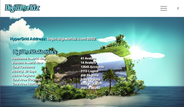
Like at the top of the DigiWorldz home page here:
Avoid using graphic images for your login URI, as this makes it harder for users to copy the text.
I am always surprised by how often I can’t find the grid’s login URI or hypergrid address at all on the home page and have to hunt around for it.
For people who are new to OpenSim, you’ll want to guide them through the process of creating an avatar and accessing your grid. Consider adding a button or link that says something like “New to OpenSim? Start here!” This should lead to a page with step-by-step instructions for creating an account, downloading a viewer, and logging into your grid.
The goal is to make the process of accessing your grid as simple and intuitive as possible. If you can, try to get someone who’s never been to OpenSim before to follow your instructions.
Remember, every extra click or step you require is an opportunity for potential visitors to get frustrated or distracted and give up.
Rent land
For most commercial grids, renting land is a primary revenue source. The land rental options should be very easy to see on your website. Nobody should hunt around for it. This isn’t something to bury in a sub-menu or hide at the bottom of a long home page.
Unfortunately, many grids make renting land far more complicated than it needs to be. They require users to create new user accounts, or provide technical details like region coordinates and specific server configurations. Unless someone is an experienced OpenSim user or grid owner, they probably won’t know this information off the top of their head. And if they do know exactly how many cores and RAM they need — well, they don’t need you, do they? They can run their own grid, thank you very much.
Each time someone has to make a decision, or look something up, half the time they’re going to say, “I’ll do that later.” And they never do it later. Instead, you will lose about half you potential customers with every additional click, every new page, every form field they have to fill out. Pretend you’re a new customer. How many clicks will it take someone before they can finally send you money? How many decisions do they have to make?
So, if, say, you have 100 visitors who come to your website thinking of getting a region, and six steps to go through before they can buy land — you’ll lose 50 people at the first step, another 25 at the second step, 12 more at the third step, another six at the fourth step, three at the fifth step. And you’ll have just one or two people left, if you’re lucky. You just wasted 99 potential customers. Sure, some of them might come back. Eventually. When they remember. Or they might forget that they wanted to get a region. Or get a region somewhere else. Or they’ll go to Second Life, because at least they know how to buy land there. Though even Second Life makes you click around a lot before you finally get to… $209 a month for a 20,000 prim region??? With a $349 setup fee???
Oh, for God’s sake. Don’t make your potential customers suffer like that! And pay so, so much for so little!
Make things easy for them. And take their money first, then figure out everything else.
Put a big, bold “Rent Land Now” button right on your homepage. When a user clicks this button, they should be taken directly to a simple, streamlined land rental page.
Or you can put a form right on the home page with your three top-selling options.
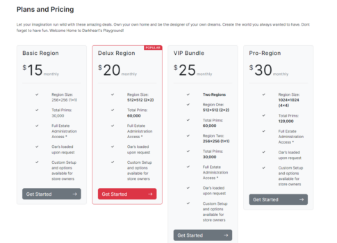
Darkheart’s Playground was the only grid I found that had a land rental box right on the home page. You do have to scroll down to find it, and the options could be simpler, but they’ve got something! Unfortunately, as of this writing, none of the buttons work. In theory, however, they could bring up a PayPal popup where all a user would have to do is click the “Pay Now” button and be in business. They can create their user accounts and decide on region names later, after they’ve given you the money.
Offer a few pre-configured land packages based on your most popular options. For example, you might have a “Starter Region” with 15,000 prims and 20 avatar capacity, a “Community Region” with 45,000 prims and 50 avatar capacity, and a “Commercial Region” with 100,000 prims and 100 avatar capacity. Each option should have a clear price and a “Rent Now” button that takes the user directly to a payment page. Or you might organize them based on who the customer is — a homesteader, a builder, an events venue, a merchant — and create default region packages that fit their needs best.
If a user wants a more customized land configuration, take them to a simple form where they can enter their desired land size, prim count, and avatar capacity. Avoid requiring technical details like server names or region coordinates — handle these on the back-end after the user has completed their purchase, or give them a default configuration that they can simply agree to.
The key is to minimize the number of decisions and technical details the user has to deal with.
Pretend you’re a newcomer from, say, Second Life, attracted by your grid’s low prices. How many clicks would it take for them to actually make a purchase?
Try to get someone who hates you to go through the process — a teenage child, for example, or a coworker whose lunch you’ve stolen. Will they be able to navigate through to the end without your help?
If your grid doesn’t rent land, replace this item with whatever else a top priority for your visitors would be.
For example, if you’re a free-to-connect grid, you can feature an at-home region-installer download.
If you’re a non-profit, use this space for a donation button. You can use one simple donation button, or have tiers for different levels of support. Explain what the donation will be used for — to buy developers coffee? To pay for backup servers? To reduce lag?
If you have a content marketplace, feature a bestselling item or a new arrival.
If you offer paid memberships, put that in this prominent location.
Latest events
The next thing you’ll want to feature on your home page is an ad for an upcoming event, to give people a good reason to come to your grid. Or you might feature a write-up of an event that just happened, to make people feel sorry that they missed out on something cool.
If you don’t have any events, offer a promo deal, or a how-to article, or showcase a freebie — something new and fresh that will reward people for coming to your website, and make them more likely to share the link with friends.
The goal is to give potential visitors a sense of the vibrant, active community on your grid and to entice them to come and check out what’s happening. This is your chance to show off the variety and creativity of your grid’s residents and events.
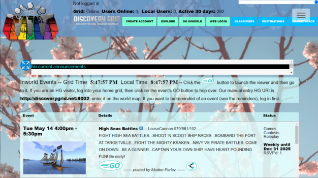
Discovery Grid does a great job here, by embedding their calendar right on the home page, with attractive visuals for each event.
Some ideas for types of events to highlight include:
- Live music performances
- Art exhibitions and gallery openings
- Fashion shows and contests
- Role-playing events and adventures
- Educational workshops and classes
- Community gatherings and parties
- Charity events and fundraisers
For each event, provide a brief description, the date and time, and a high-quality image that captures the excitement and energy of the event. If possible, include a direct link to the event location on your grid, so visitors can easily teleport there.
In addition to featuring specific events, consider showcasing user-generated content and activities on your grid. This could include:
- New and notable builds or regions
- User-created games and attractions
- Popular social spots and hangouts
- Featured merchants and creators
By regularly updating your events and activities section, you’ll give visitors a reason to keep coming back to your website and your grid. They’ll see that there’s always something new and exciting happening, and they won’t want to miss out.
Remember, the goal is to make your grid irresistible to potential visitors. By showcasing the vibrant, active community on your grid and highlighting all the amazing events and activities happening there, you’ll give people a compelling reason to come and experience it for themselves.
Having fresh content on your home page will also help your grid rank higher in search engines. You can also cheat, and embed your social media feed. For example, if you regularly post stuff on Facebook or another social media platform, embed the feed to get fresh new stuff for your home page all the time. Well, as long as you keep your social media fresh.
Littlefield Grid, for example, embeds their Twitter feed on their home page. OSgrid and AviWorlds embed Discord pages. GroovyVerse embeds their Mastodon feed and shared snapshots from residents. ZetaWorlds features their latest blog posts.
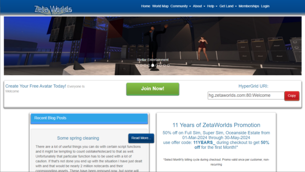
ZetaWorlds, by the way, also makes it super easy to grab the hypergrid address with that nice red “Copy” button, the green “Join Now!” button takes you to a signup page with a nice choice of membership levels, and the images on the home page feature people!
Login button
This is one item that nearly every grid has, and it’s where it should be — at the top right of the page.
That’s because they know that a top reason that people come to their website is to do stuff with their accounts, like submit support requests.
Good job, OpenSim grids.
Keep it simple
That might seem like a lot of stuff to put on a single page: a picture of people, a hypergrid address, a land rental box, a new event or announcement, and a login button at the top right.
But if you look through grid home pages, you’ll often find that they’ve got a lot of stuff crammed in there, most of it which isn’t a top priority for either users or grid owners.
Some grids put their mission statements on the home page. In my opinion, these are all identical and a waste of space that takes focus away from the things that you actually want people to pay attention to. Some grids post detailed technical details about their configurations. Some grids post random graphics unrelated to OpenSim.
Many grids post stats boxes. I’m all in favor of grids publishing their stats, but this is one thing you can safely put in a drop-down menu or at the bottom of the page. Stats are a nice-to-have — for me, anyway — but if they take away real estate that can be used to promote an event or a land sale — go with the event or land sale.
There’s only so many things a person can absorb when they look at a website. Too much clutter will drive people away.
You can put everything else in drop-down menus or further down on the home page, where people can scroll to see it.
A note about grid stats
Now, I know that grids don’t have to publish their stats. And some grids probably shouldn’t — there’s no reason for a school grid or a company grid only used by its employees to tell the world how many visitors it has.
But public and commercial grids should publish their stats, because it’s a free inbound link from Hypergrid Business every month. Our monthly stats report is one of our best-read regular posts, and people check the lists we publish to find new grids to visit.
If you have a grid, you can check that it’s on our active grids list, and if you want to know if we’re collecting your grid’s stats, check out our April 2024 raw stats report.
If you don’t have a stats page, or want to make sure that your stats page is as easy as possible for our database to read, so that there aren’t any mistakes, it should have the following information:
Total number of registered users: 123
Total regions: 4567
Unique 30-day visitors: 890
The way the scraper looks is that it searches for a key phrase, then grabs the numbers immediately after the phrase.
I prefer to see regions counted in the form of standard region equivalents, but my database can also handle square meters and square kilometers. And, for active monthly users or unique 30-day visitors, I prefer to have a single total of both local and hypergrid visitors. You can also have other stats on your stats page, but these three are the ones that I track to have consistency for comparison purposes.
I also prefer it when the stats page is as simple as possible, with no tables, animations, or weird graphics to mess up the parser.
If you want to see examples of stats pages that work well for me, check out the DigiWorldz stats page, or the Alternate Metaverse stats page, or the Wolf Territories Grid stats page. That last one is my favorite because there are no thousands separators in the numbers. The thing with separators is that some countries use commas, some use periods, and some use apostrophes. Arrgh!
If you’ve ever wondered why I’m the only one who collects these stats every month, and why there are so many mistakes in them — this is why. It’s pretty much impossible to write an automated system to collect stats because every grid formats them differently. So there’s a lot of manual labor involved, folks.
Why should anyone care about OpenSim stats? They’re meaningless, right? Who cares how many people a grid has? No, there’s no reason to care except… marketing!
Every grid that reports users is more social proof that people are using and enjoying OpenSim. The more grids report their stats, the better. Even if your grid is small — some people prefer small grids.
And don’t forget: other grids aren’t your competitors. Your biggest enemy is the fact that Second Life users don’t know that OpenSim exists. Once they find out, and learn about the great prices we have here, the superb amount of control people have over their own regions or private mini-grids, and the awesomeness that is the Kitely Market, then they come. And they stay. And they’ll visit multiple grids until they find one that fits them best where they can settle down and make their home. And they’ll go shopping, and attend events, and donate to performers, and do all the things to grow the platform.
Every single grid that brings in people from Second Life helps all the grids. Every single article or post or social media share that tells people that OpenSim exists helps everyone.
What's Your Reaction?


![[Computex] The new be quiet cooling!](https://technetspot.com/uploads/images/202406/image_100x75_6664d1b926e0f.jpg)


